Podcast App
Throughout my senior of college, I worked on and off on a Podcast app written in pure SwiftUI. I listen to a lot of podcasts so I had some ideas about what would make my perfect podcast player (even if it wouldn’t be a very successful one in the mass market). I was also looking for an excuse to learn SwiftUI and other iOS technologies, like CloudKit and Combine. This was the perfect way to do just that.
I’m pretty happy with how the app turned out- it’s still not in an entirely bug-free and ready-to-release state (and likely never will be), but it’s pretty darn close and is my favorite way to listen to podcasts.
Here’s a quick video demo of the app:
The app is doing a few things differently than what I’ve seen most podcast apps do.
UI Design
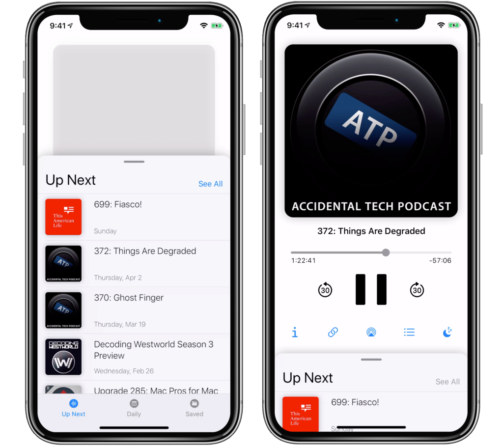
The common design for media playing apps on mobile is to hide playback controls in a bottom-sheet and use the main screen of the app for browsing podcasts. This has always frustrated me because (for the way I listen to podcasts), my primary reason to open the app is to interact with those playback controls- not to browse. My design reverses this behavior- putting playback controls front-and-center as the main screen of the app and using the bottom sheet for the podcast library.

I found this to be really nice in practice as it removes much of the friction I encounter with other podcast apps.
Queue Management
One of the main reasons I wanted to create my own podcast app is I was unable to find one that organized my “up next” queue in the way I wanted.
I like listening to podcasts the way I think most people watch TV. When I start listening to a new show, I want to listen from the first episode and go all the way through. If I’m on episode 7 of a podcast and they release episode 231, I don’t want to be notified about that new episode. Contrary to this, most podcast players prioritize the latest episode of the podcasts you’re subscribed to, regardless of what episode you listened to last.
That being said, I am fully caught up with many of the podcasts I listen to and if those podcasts release a new episode, I do want to be notified and I want those new episodes to go to the top of my queue.
As it turns out, this is essentially how most TV streaming services manage your “Up Next” feed. As you’re binging a show, they’ll keep presenting you with the next episode. But- if a new episode is released for a series you’ve watched in the past- that new episode goes to the top of your feed. This is how I designed the queue in my podcast app to work. It allows you to listen chronologically through old podcasts while keeping up with new podcasts without any additional management or friction.
The one exception to the above thinking is the way I listen to daily news shows. In this case, I always want to be hearing the most recent episode- even if I happened to have missed yesterday’s (or even if I listened to only the first half of it).
So there’s two main tabs in my podcast app’s library: “Up Next” and “Daily”. You can subscribe to any podcast in either feed- if it’s a “Daily” podcast, you’ll only see the latest episodes of that podcast in your feed. If it’s an “Up Next” podcast, you’ll always see the next episode chronologically based on your listening history.
Overall Experience
I had a lot of fun working on this app. There were a lot of interesting UI and programming challenges to work through. Working on an app I have a daily use for was especially rewarding.